The colors artists use are extremely different from one another. And that is okay. There is nothing wrong with picking your own unique palette of beautiful colors. Your colors say a lot about your style and the type of artist you are.
Whenever another artist tells you that you need to use different colors, or ones that they love, don’t put too much stock in it. When someone tells you “you ought to use this blue or that red,” you have to resist all of that. Just because something works for someone else, it doesn’t mean that it will work for you. Or that you will even like it.
Always follow your gut, and listen to your heart. Picking your color palette is one of the most crucial things an oil painter can do.
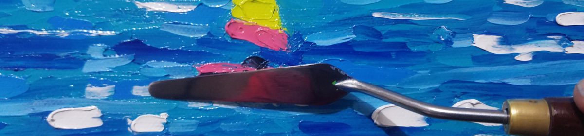
Now if you don’t have a ton of experience painting, then by all means take notes from your peers and see what they are using. I’d like to share with you some of the staples on my own palette, especially when painting sunsets. All of these colors I have pretty much stumbled upon. By happy accident, of course! So here they are.

Titanium White
I could not work without this amazing color. White is actually my favorite color, although it is technically all of the colors in the spectrum, or the absence of color (like most people say). I use TW to tint all of my colors on my palette. I also use it to paint bright white clouds and waves under a bright sun. There are other good whites, but nothing is stronger and more pigment-rich than this one.

Pthalo Blue
This cool blue is incredibly strong. The pigment Phthalocyanine has a dramatic tinting strength, which you will need to look out for in your mixtures. Mixing Pthalo into another will overwhelm the other color quickly, so use small dabs of it. It’s powerful tinting capacity aside, this is a gorgeous true blue that is priceless when painting the sea and deep blue skies.

Ultramarine Blue
I have a warm and a cool blue on my palette. This is the warm blue, meaning it leans more towards red on the color wheel. Ultramarine Blue has a slightly purplish undertone to it, which makes it invaluable for painting the shadows in cloud formations and wet sand impressions. I use a TON of it mostly because by mixing this color with Burnt Sienna, I get a brilliant chromatic black, which is a lovely rich black that won’t kill your other colors when mixing.

Burnt Sienna
Burnt Sienna is a warm reddish brown color that is the other half of my black! It is a terrific color I found after I became tired of mixing this from blue, red, yellow, and black. I wanted something quicker and easier. This color is nice for the trunks of my palm trees, grass, rocks, and for warming cooler colors.

Manganese Violet
This is a beautiful shade of violet made by the Old Holland line of oils. It is rich, deep, and bright out of the tube, and it cannot be mixed from other colors. This is a fabulous sunset color in your velvety skies. It is also great for flowers. I use this one sparingly.

Brilliant Pink
Also by Old Holland, I am using this one more and more. It is lush, bright, and tropical. I love to use this for mixing various tints and shades for the tropical flowers which dot a lot of my paintings. You can get a shade similar to this one from mixing white with Cadmium Red, but it will not be as brilliant and true.

Carmine Red
Carmine Red is similar to Cadmium Red Medium and other popular pigments. It also makes great magentas, pinks, and browns. It is bold and also has a high tinting strength, so a little goes a long way. CR is a deep blood-red shade that is sure to liven up your sunsets.

Cadmium Yellow Medium
And lastly we have Cadmium Yellow Medium, which leans towards orange when compared to the “light” of the same name. All of the cadmium colors have high pigment concentrations, which makes them more expensive. They are also fairly toxic, so make sure you have proper ventilation in your studio. This is great for grass, trees, sunlight and bursts of color through the clouds. Mix it with Cadmium Red to get orange, and Pthalo Blue to get a true green.
My new sunset painting below was created using all of these wonderful colors.

Don’t forget to check out my art painting tutorial channel on Youtube, and also my Etsy shop.
https://www.youtube.com/channel/UCoDaJL5tkFEHCzrC_yYrmcA
http://www.etsy.com/shop/RKBeachPaintings
I am working on growing my audience and could use your help! So if you haven’t done so yet, be sure to follow my shop and this blog. Also be sure to hit “like” and subscribe to my channel on Youtube.
Thanks for reading, and I hope this has inspired you to bring your own colors into the world.
Give it a bit of beauty.
Ryan Kimba
http://www.ryankimbaart.com


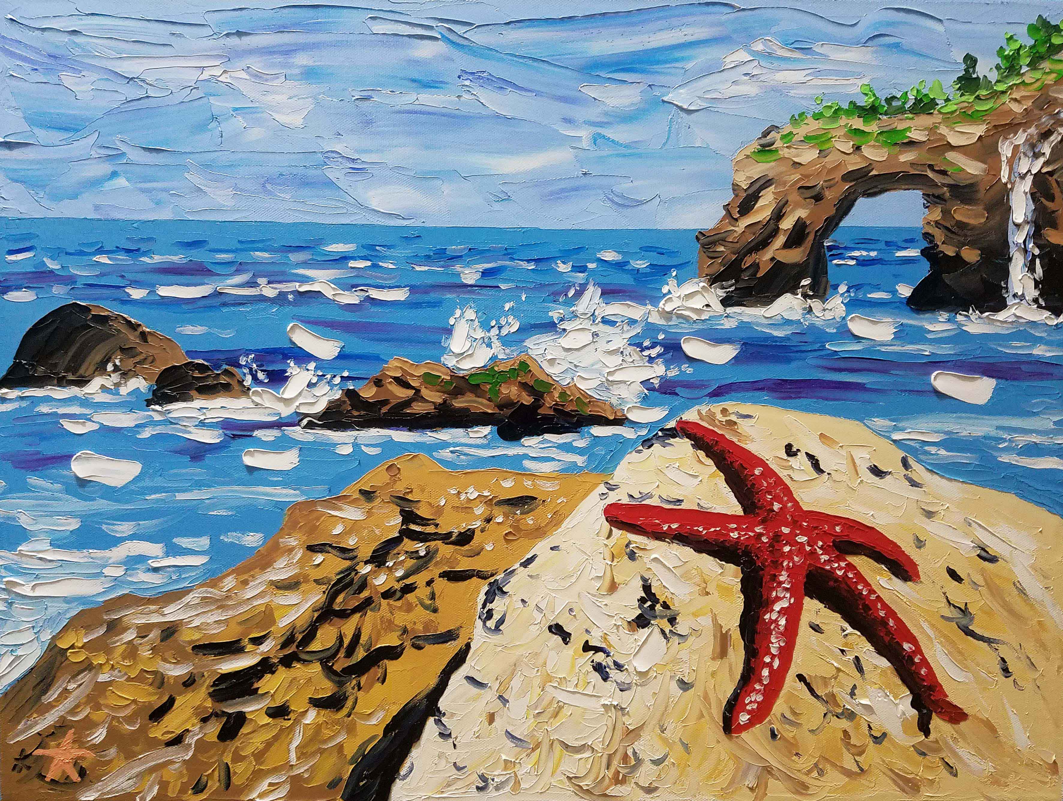
 A Part of Your World 18×24 inches oils on canvas


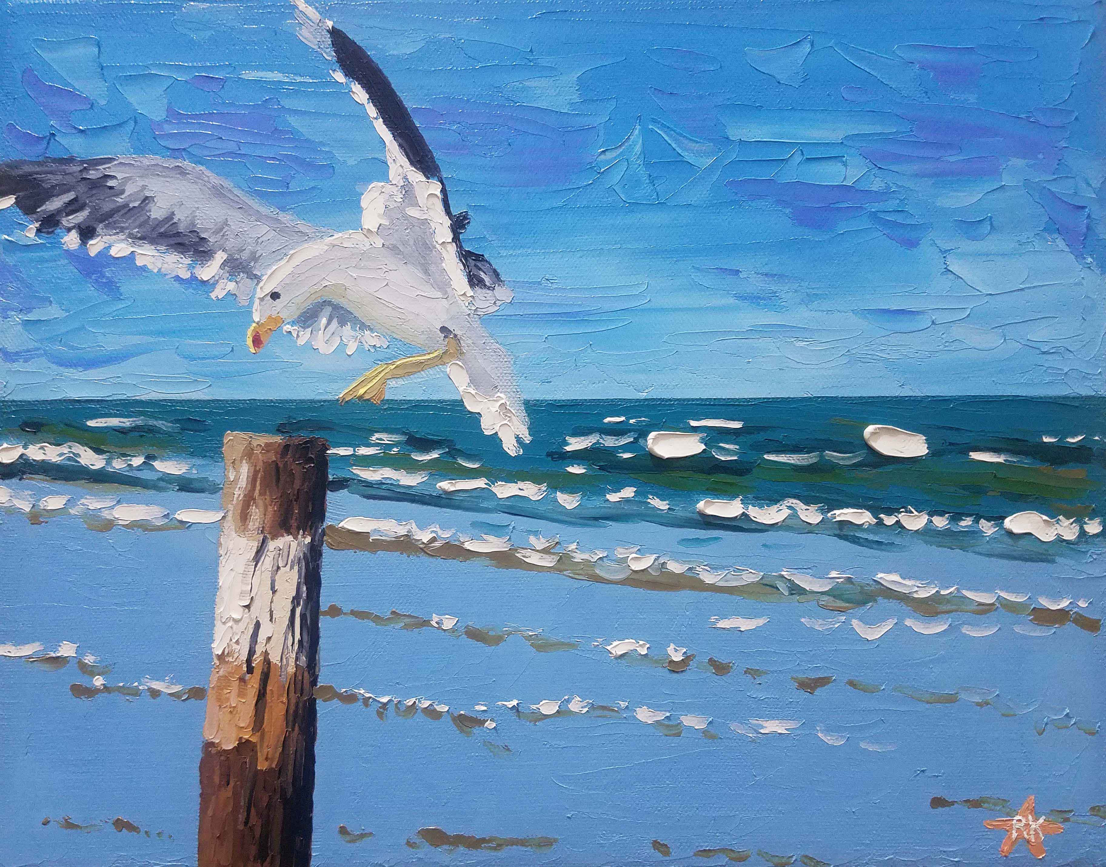


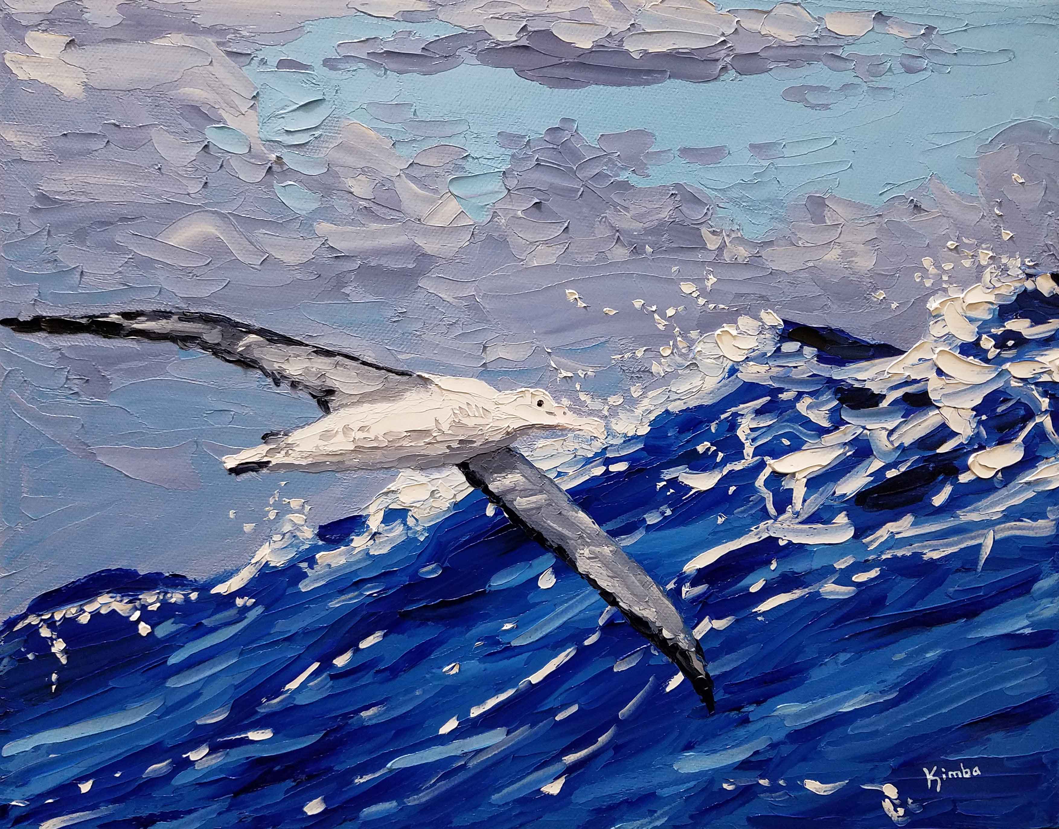
 Golden Minutes Oils on canvas 11×14″
 Hold Our Hearts Oils on canvas 11×14″
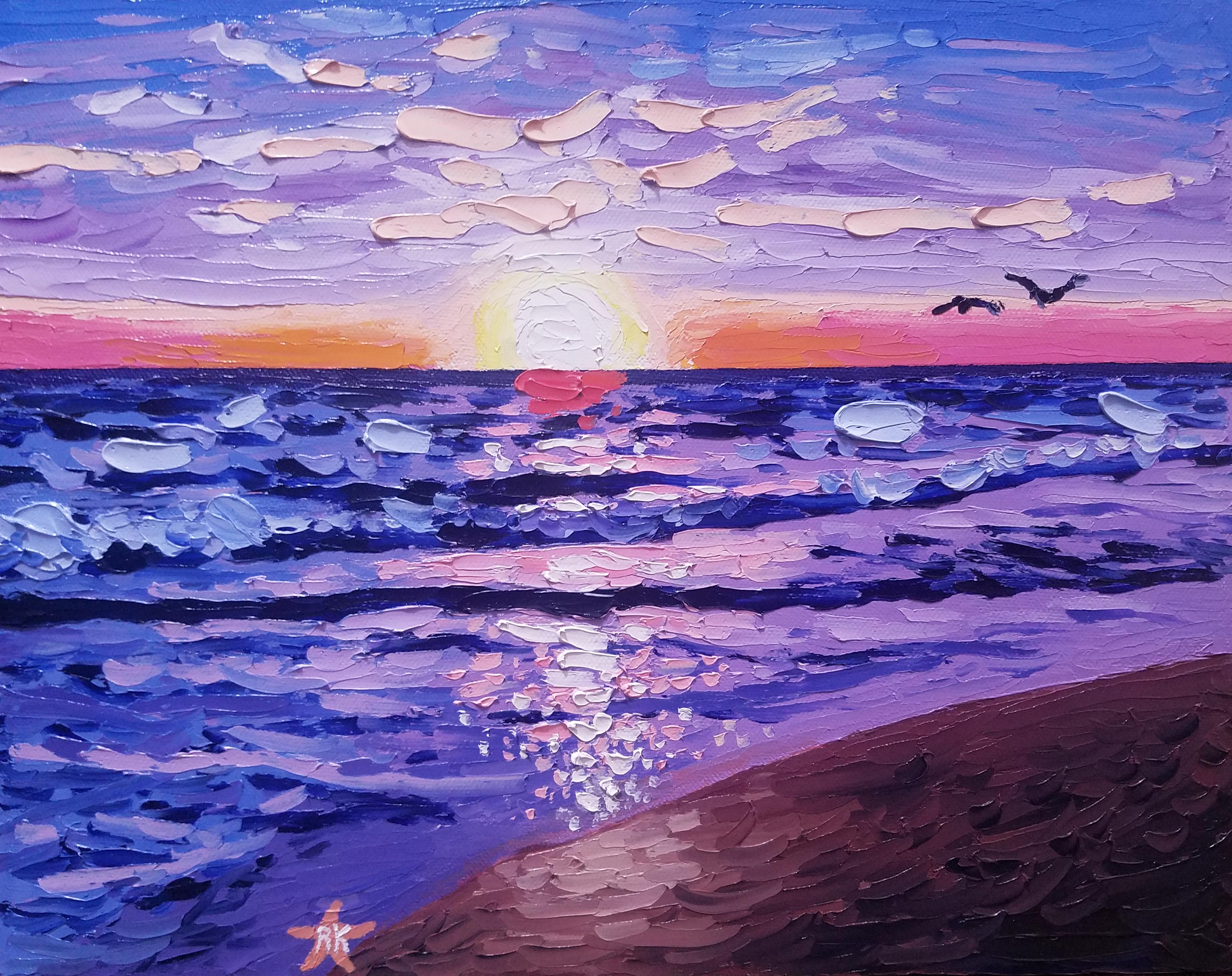 Goodnight Sun Oils on canvas 11×14″
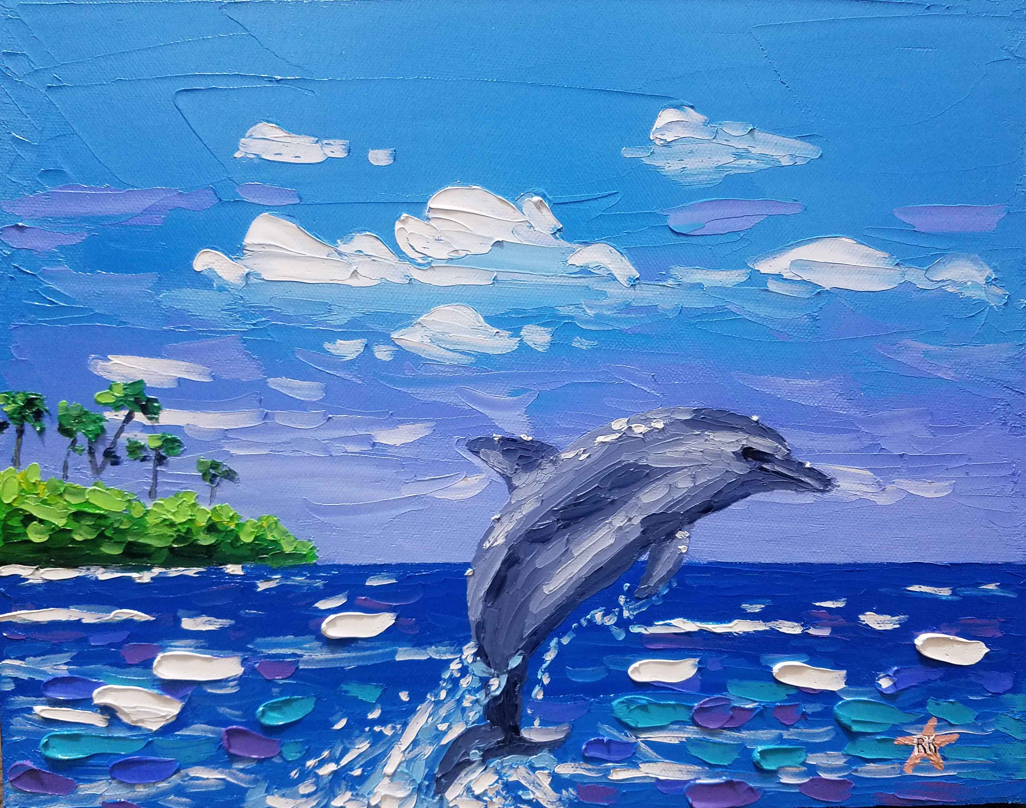
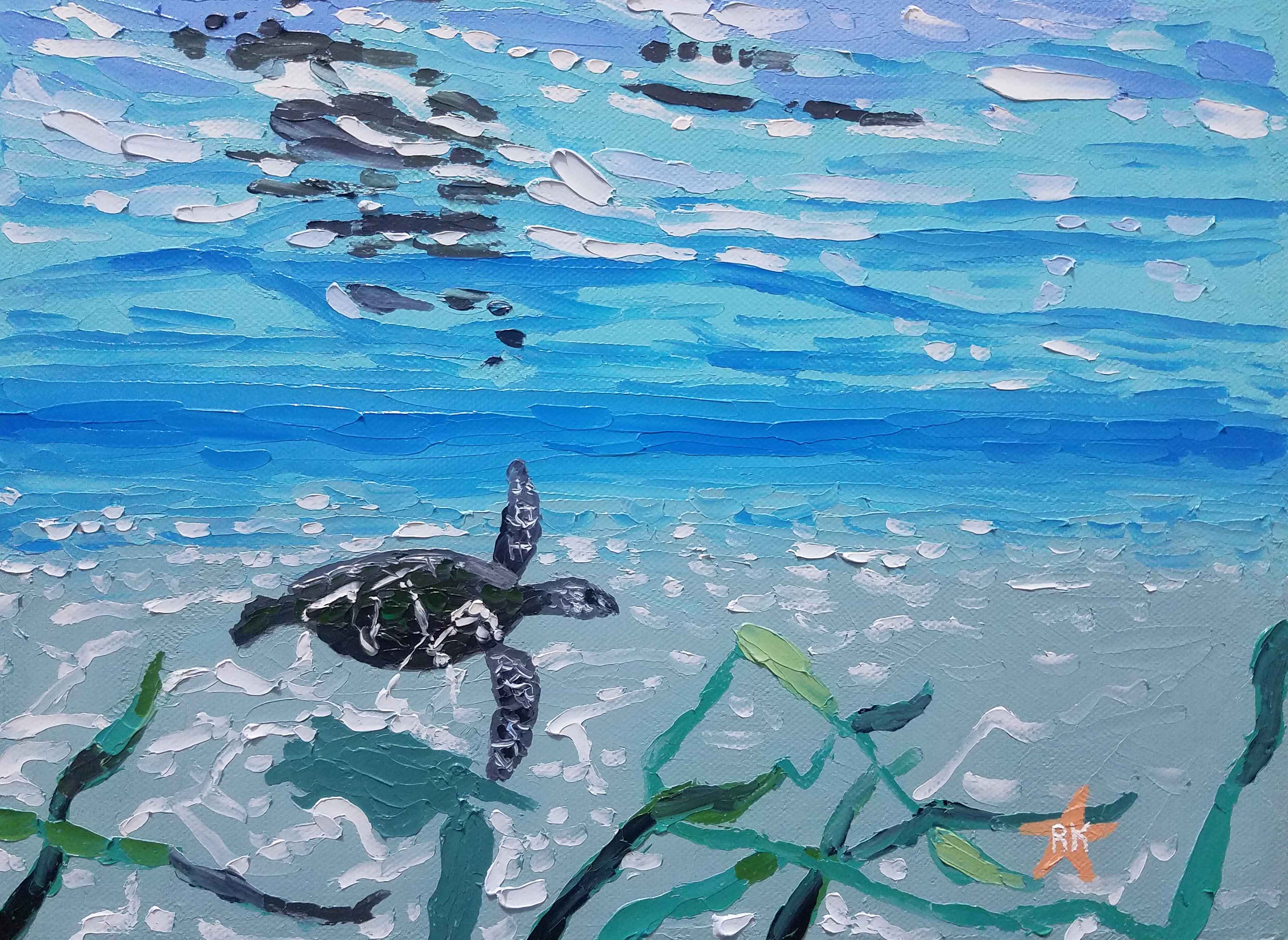
 Playing in Crystal Waters, Oils on canvas, 11×14 inches


